SNIIP

Ideation / UI/UX Design / UX Research
No Manga, NO LIFE 💀💀💀
SNIIP
Every Manga, Everywhere, Everytime

With $2000 in funding, SNIIP revamped manga reading for Western audiences on a mobile platform, prioritizing accessibility, diverse content, and overcoming streaming and legal challenges.
Methods
Tools
[ High level problem + Solving ]
Problems with the Manga distribution
Restricted access to Japanese manga on existing platforms prompts SNIIP to create a secure, legally compliant platform with efficient translations for a streamlined Western manga reading experience. The main problems the platform attempts to tackle are the followings.
- Illegal distribution without consent from authors.
- Nonstop crashes in the service.
- Changing IP addresses
- Intrusive ads making users leave while reading
[ Final Solution ]
Mobile Manga Platform
Introducing SNIIP, a personalized, faster, and accessible manga platform.
[ Formal Research ]
Competitive Research
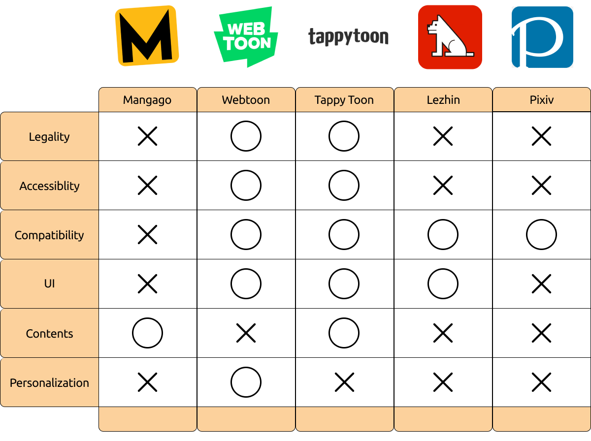
Five platforms struggled with connectivity and lacked personalized manga content, leading to a static and disengaging user experience.
[ Primary Research ]
Semi Structured Interviews, Surveys
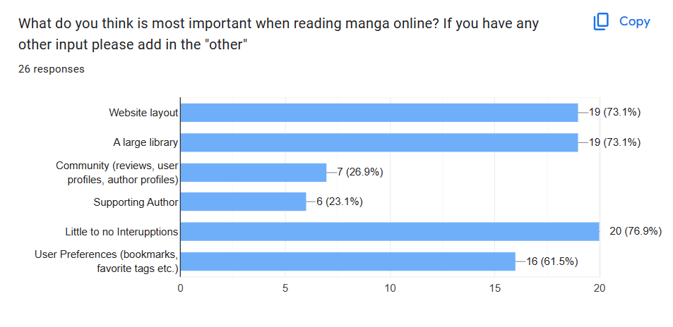
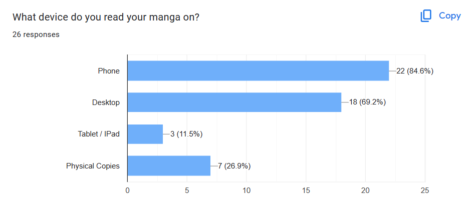
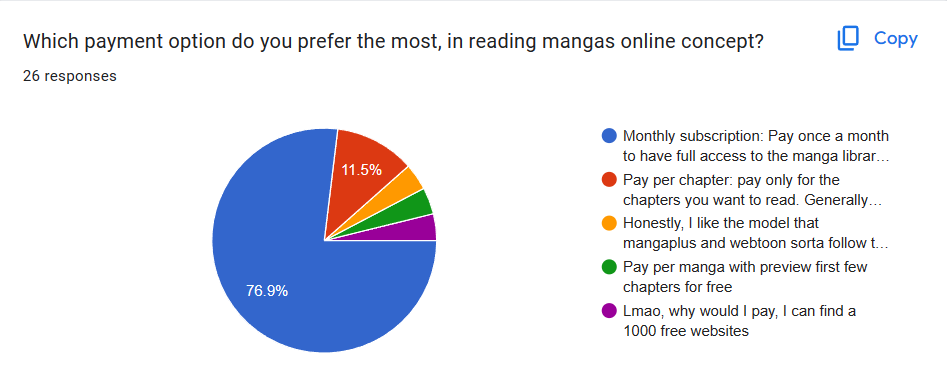
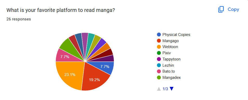
Utilizing Zoom interviews and Google surveys, our primary research focused on understanding the preferences and experiences of manga readers in college, both online and offline.
Additionally manga publishers were interviewed
Data Visualization
[ Insights ]
Main Insights from Interviews
Through extensive interviews, we gained valuable insights into the challenges and pain points experienced by current manga enthusiasts using mobile and desktop platforms.
1. Demand for a distraction-free and accessible manga search and viewing platform.

2. Users seek a stable manga platform resilient to legal and online stability issues.

3. Users desire free access to manga chapters without individual episode payments.

4. Users seek personalized manga selection based on their interests.

[ Defining Scope ]
Narrowing the Problem Space
Having identified user pain points, our team expanded the scope to delve into the root causes. This broader investigation revealed that the issues stemmed from the following underlying problems.
1. Many lucrative manga contents remain untapped in the Western market.
2. Limited platforms for accessible and stable manga reading.

[ How Can We Questions ]
Top Three Questions
For SNIIP, we focused on three key questions: boosting interactions, streamlining manga selection, and creating a customizable environment for optimal user experience.
1. How can users feel their interactions with the authors and their access to the manga trustworthy?
2. How might we minimized user effort in searching for manga?
3. How might we allow users to customize the app according to their preferences of manga?
[ Synthesizing 1) ]
Stakeholder Mapping
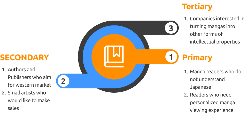
In the synthesis phase, we identified primary users as readers seeking personalization and Western users interested in understanding Japanese manga.
[ Synthesizing 2) ]
Personas
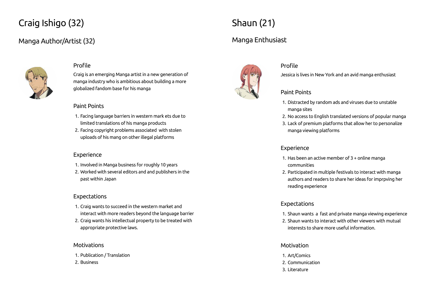
Two persona were crafted for our product: a manga publisher/artist and a manga enthusiast, symbolizing authors and readers, approach to attracting both avid readers and creators seeking enhanced exposure for their works.
[ Brainstorming: Crazy 8 ]
Possible Ideas
In a team brainstorm, we chose "Gamification design," "Author introduction space," and "Personal library" to achieve our goal of an Interactive, Accessible, and Personalized manga experience.

[ Reasons ]
Why this Decision?
We're differentiating our platform with interactive and personalized features. Choices like gamified design, author pages, and customizable libraries induce continuous engagement of viewers from one page to another.
[ Requirements Planning ]
Functionalities
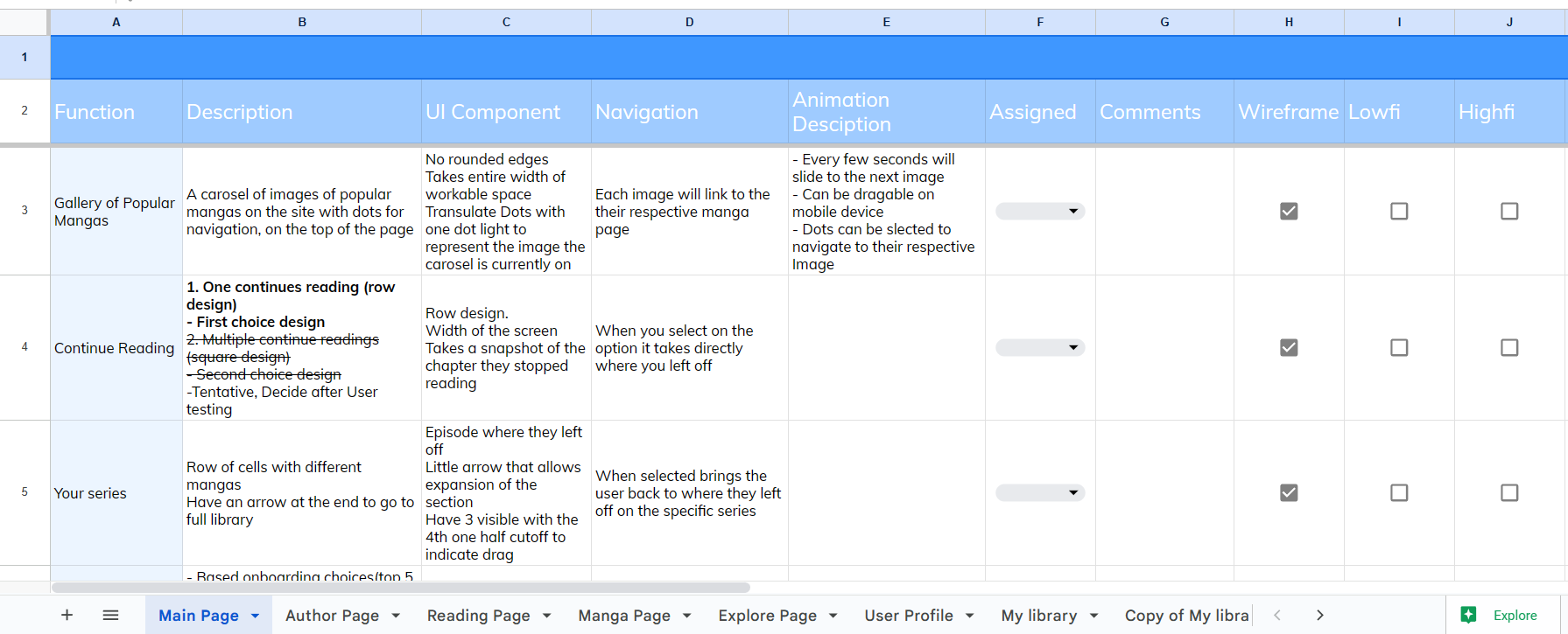
Before designing, we outlined functionalities on a Google Sheet. Intuitive animation planning streamlined team efforts, prioritizing flexibility.
[ Mapping ]
User Flow
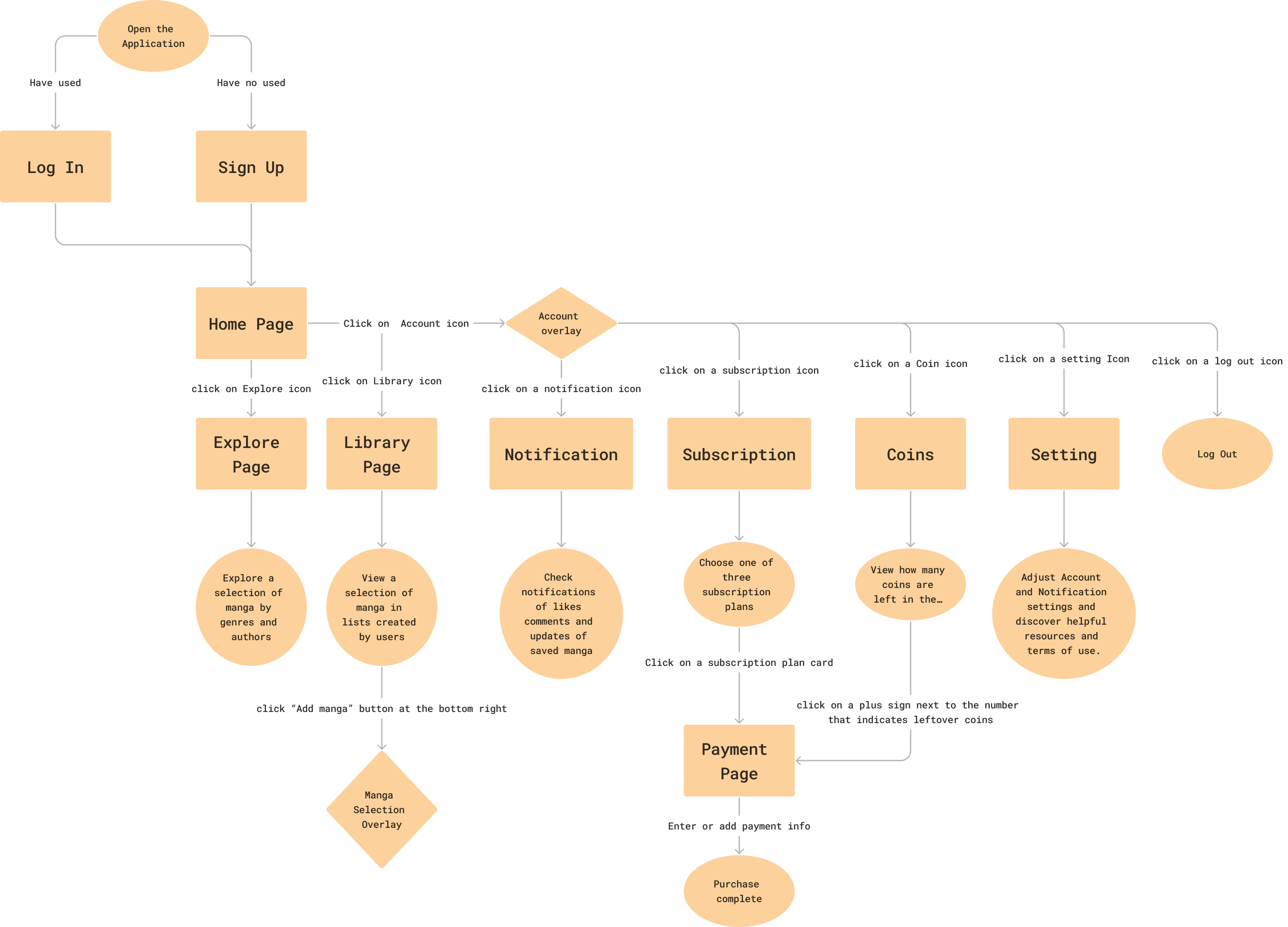
Beyond functionality, we devised a User Flow map with icons and diverse in our prototypes—crucial for a functional end product.
[ Architecture ]
Information Architecture
The team begun building an information architecture for our mobile product so that we could recollect what decisions we have made while brainstorming and affinity diagraming.

[ Rapid Prototyping ]
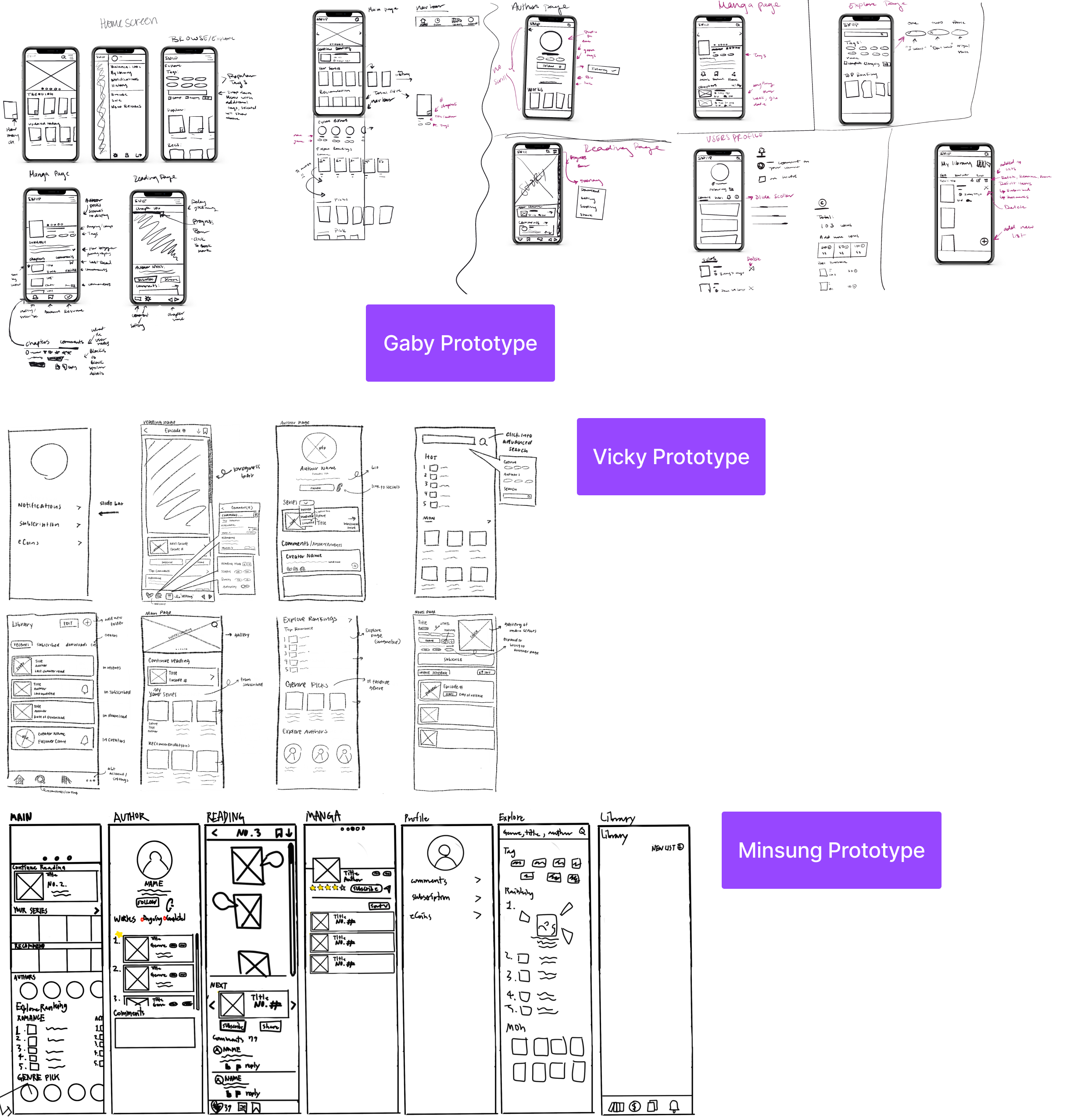
Low-Fidelity Prototype: Sketches
For the initial prototypes, our designers exchanged each one's strongest sketches, combining the best assets to create an enhanced version.
[ Wireframing ]
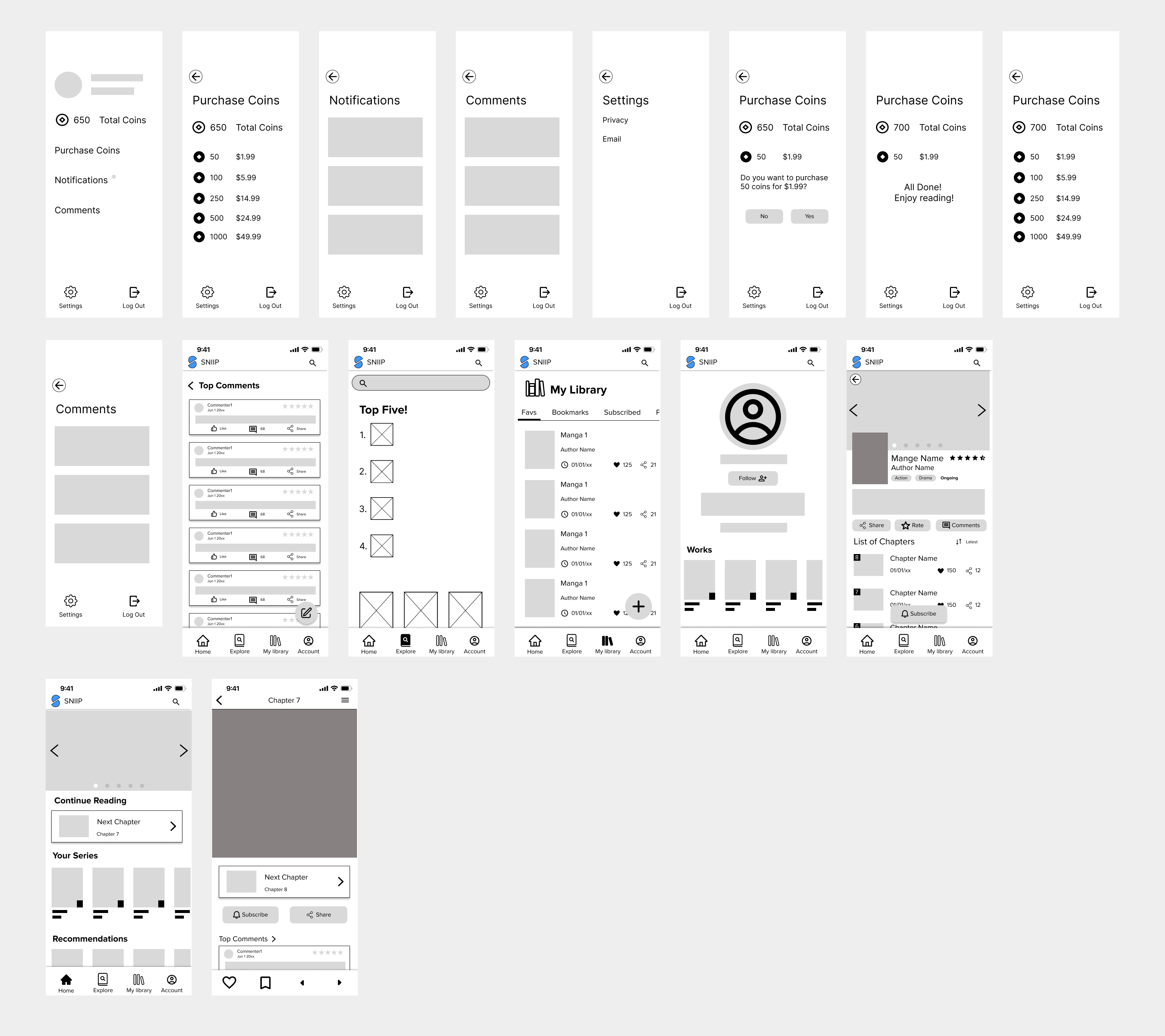
Low-Fidelity Prototype: Combination
[ User Test: Contextual-Inquiries ]
User Test #1
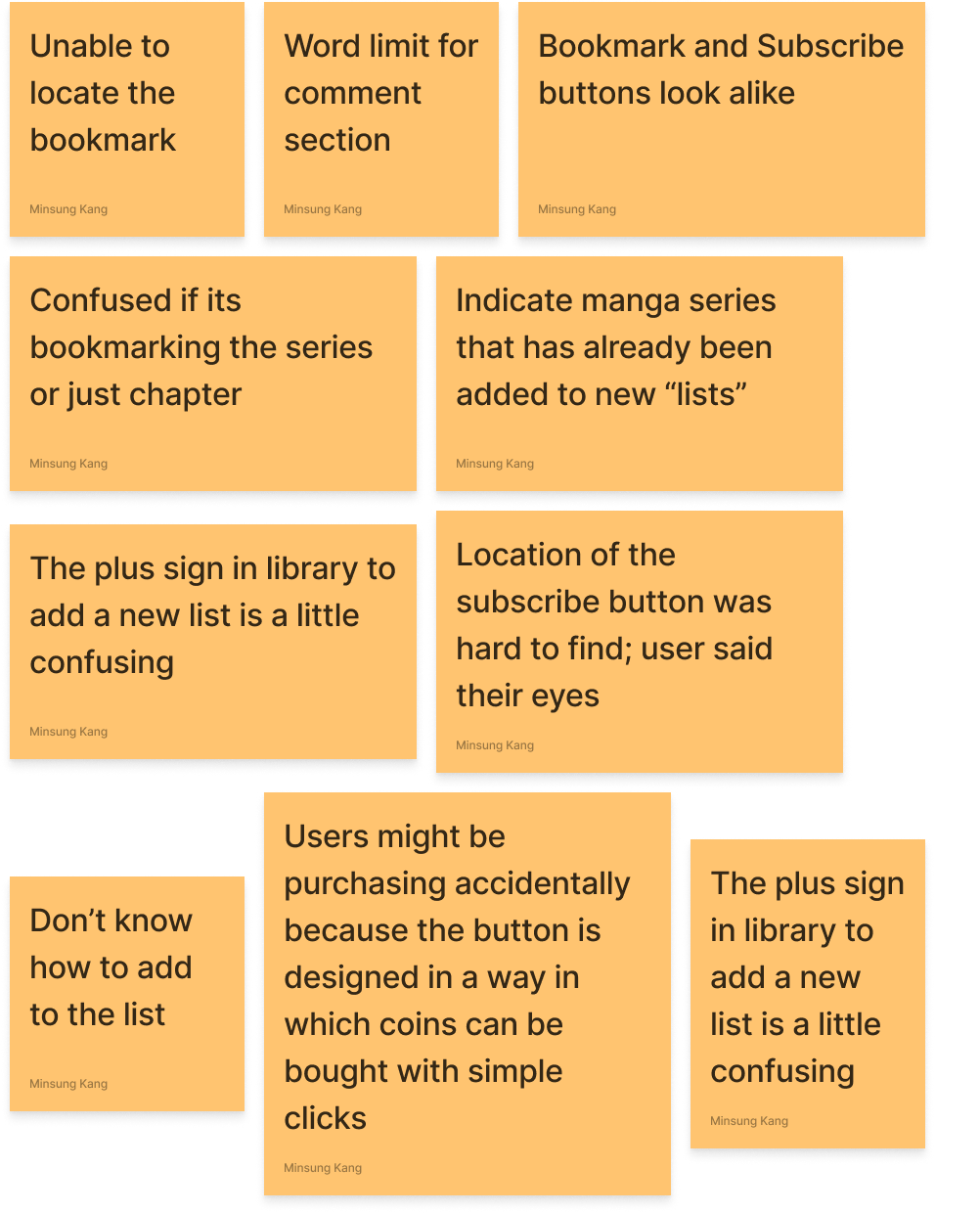
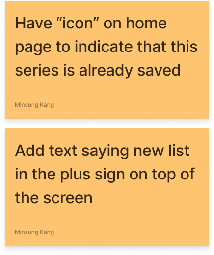
We Zoom-tested manga users, pinpointing micro-pain points: complex search and messy libraries. Adapted our prototype for a more user-friendly manga experience.
Test Results
Solutions
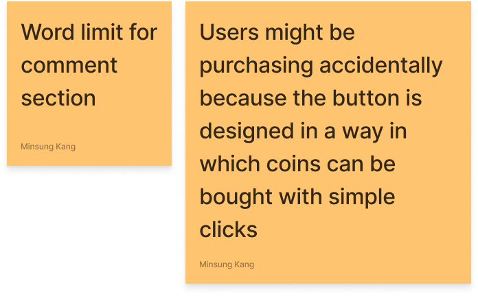
Implementations
[ Wizard of Oz, Think Aloud ]
User Test #2
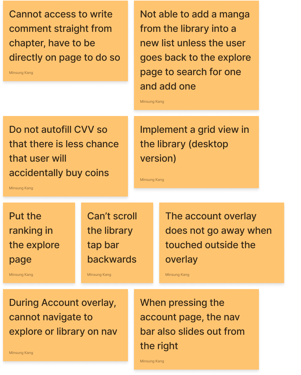
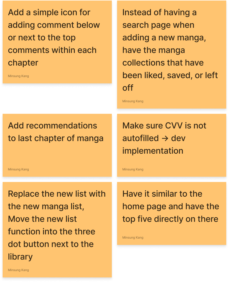
In the second round, we refined our prototype using the Wizard of Oz technique in Figma. Users verbally shared thoughts as they interacted, providing insights on the evolving design.
Test Results
Solutions
Implementations
[ Design System ]
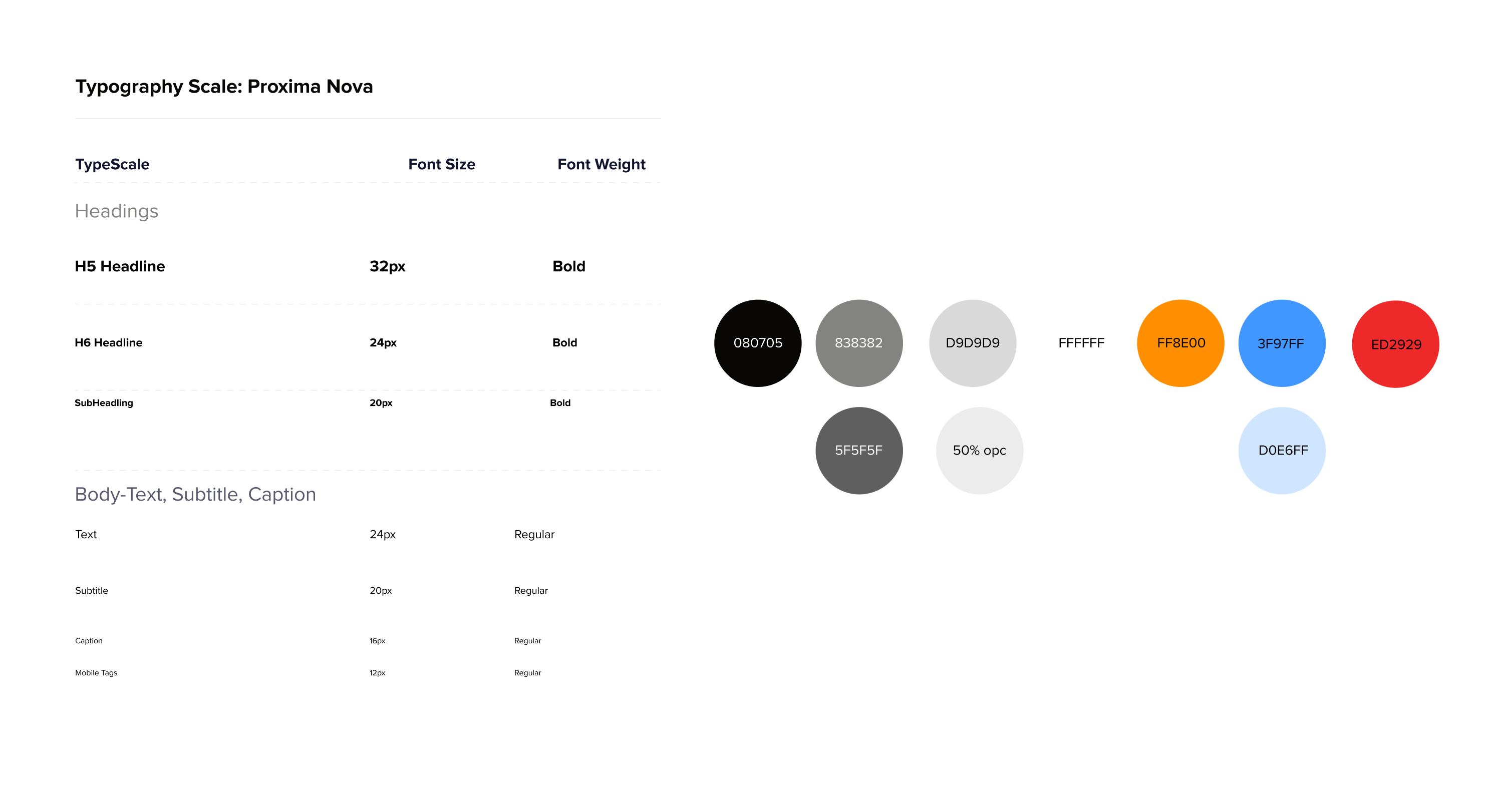
Fonts and Colors
We selected orange and organelle for a professional yet playful vibe. Incorporated soft, organic-inspired geometric designs for a youth-friendly appeal.
Final BreakDown
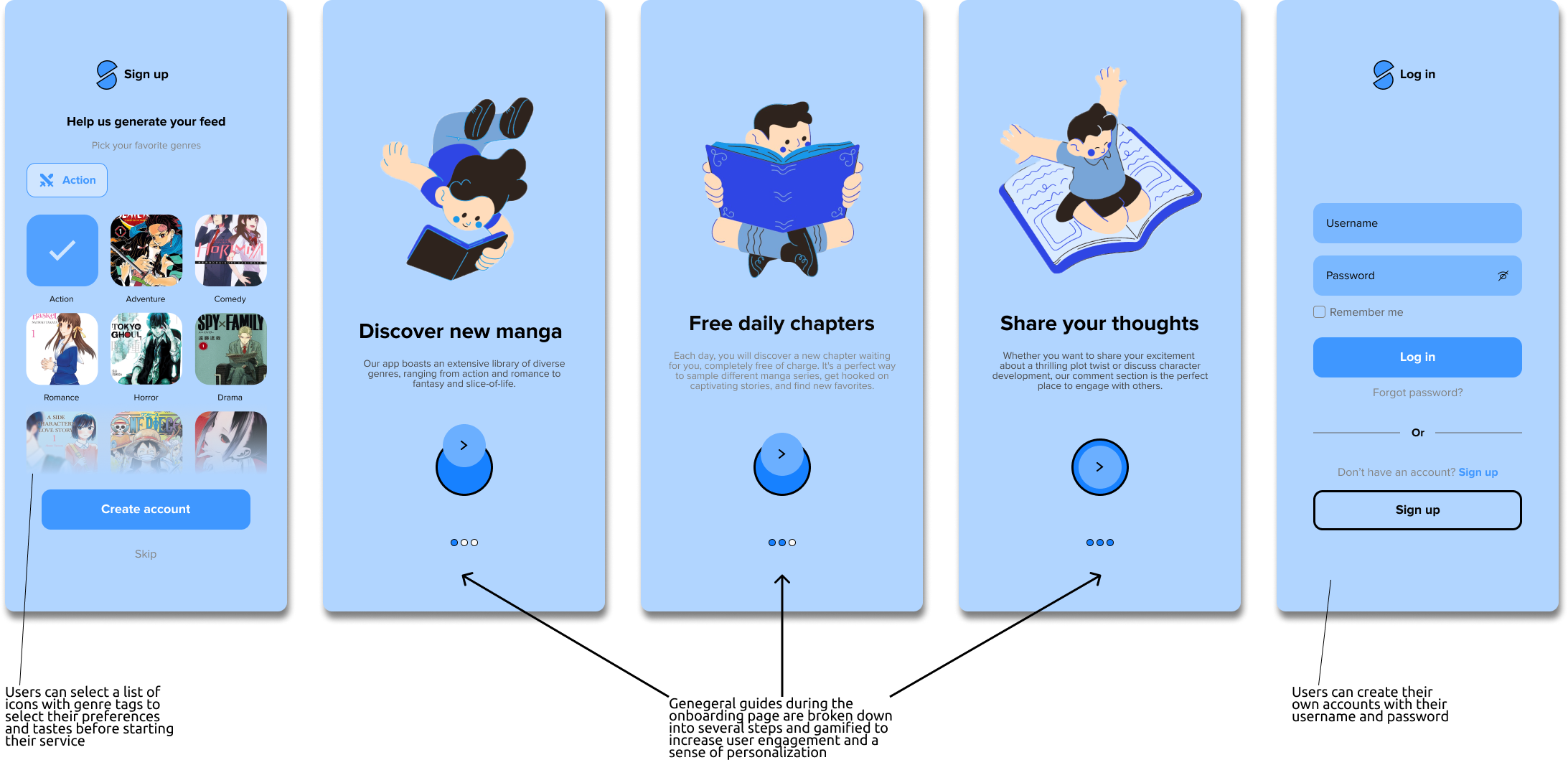
[ Pick Genres ]
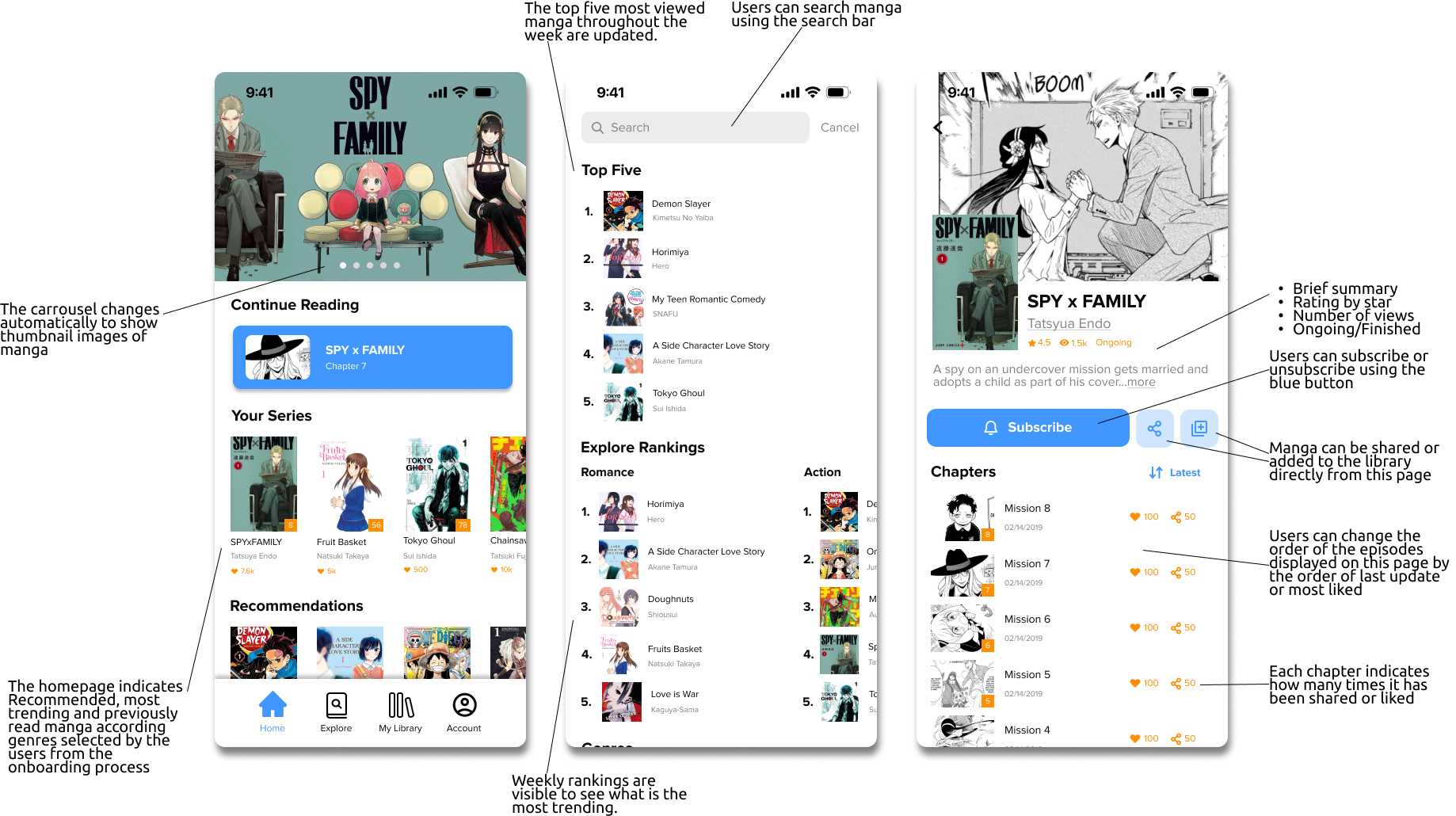
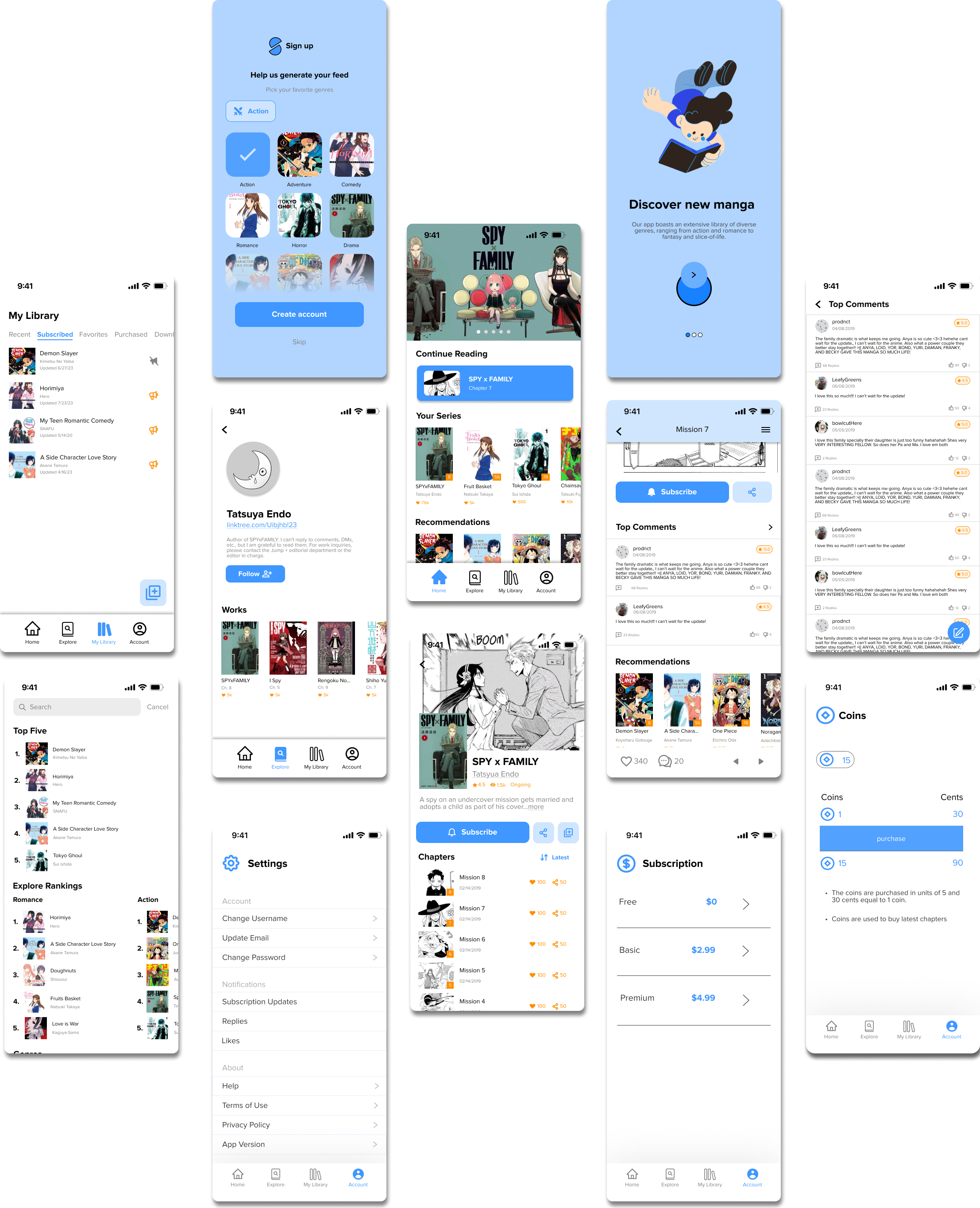
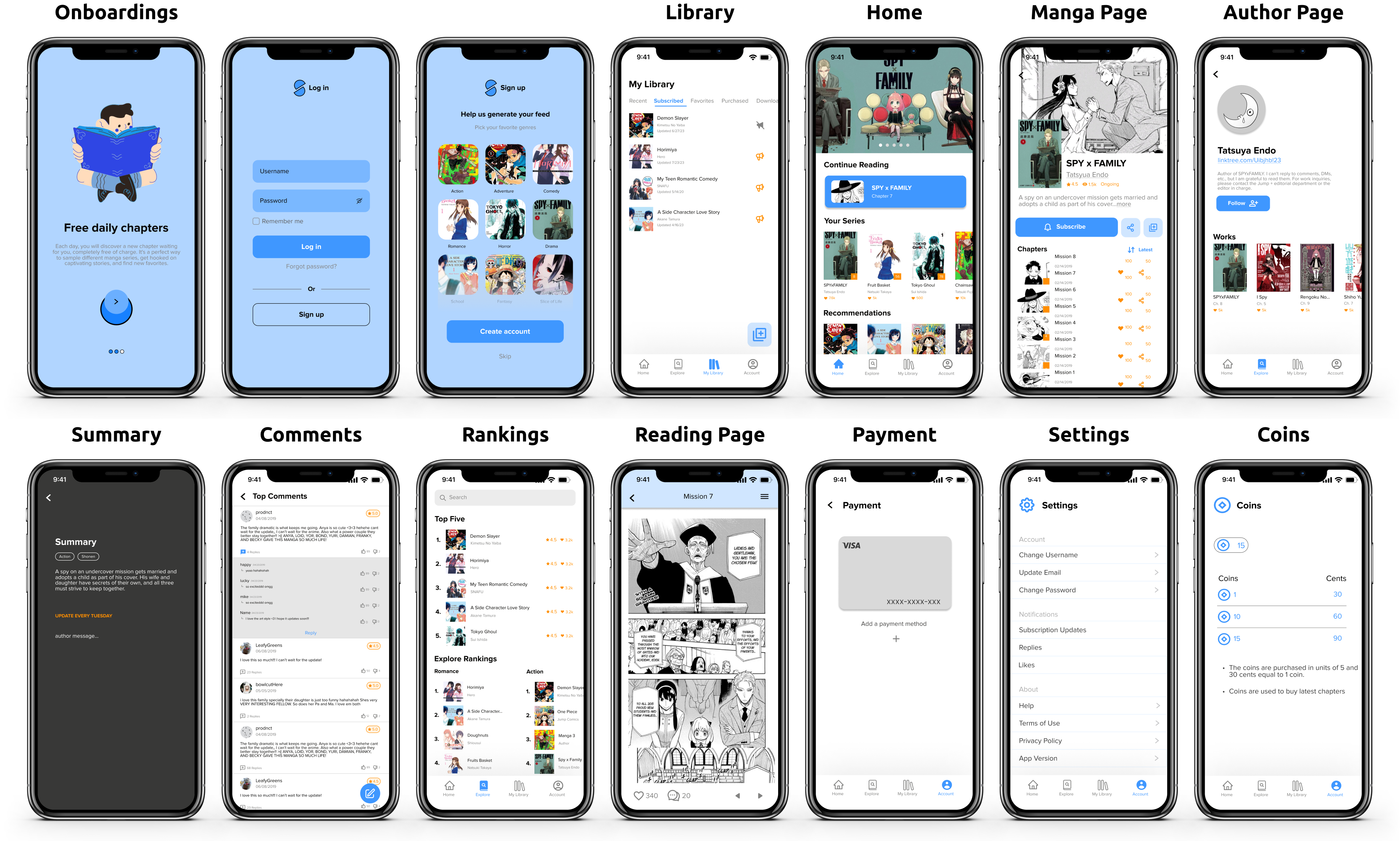
Onboarding lets users choose favorite genres for personalized manga suggestions on the homepage.
[ Personal Library ]
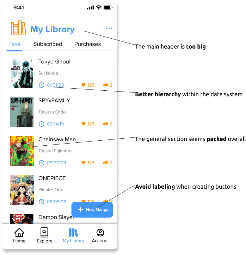
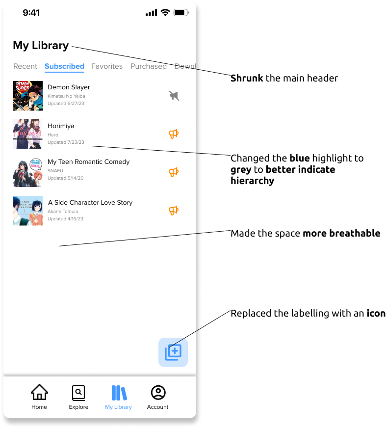
Users can add/delete manga in libraries, creating multiple categories based on their preferences.
Initial
Final(After Change)
[ Reading and Author Exploration ]
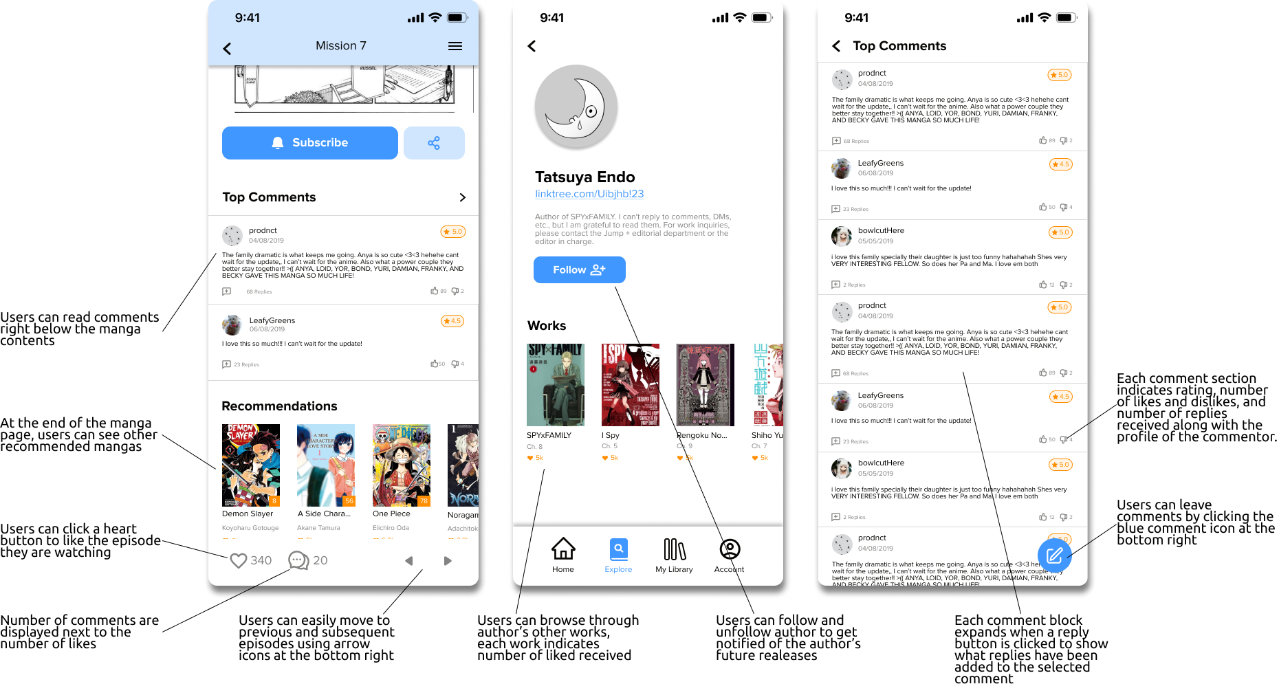
Explore manga authors and their works on the author page. Leave comments at the end of each episode to share thoughts on the stories.
[ Browsing Manga ]
App showcases manga via genre rankings, personalized suggestions, and daily/weekly top picks.
